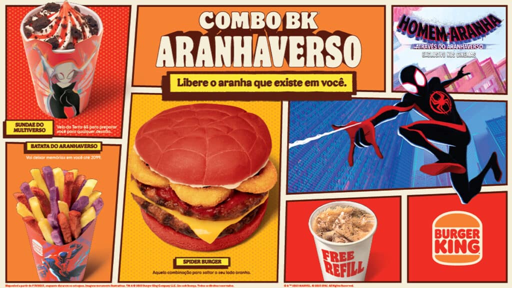
Creation of the first feature made by Burger King in partnership with Sony, where a customized and interactive landing page was created with the action of SpiderVerse, with an aggregated part inside the store’s app.
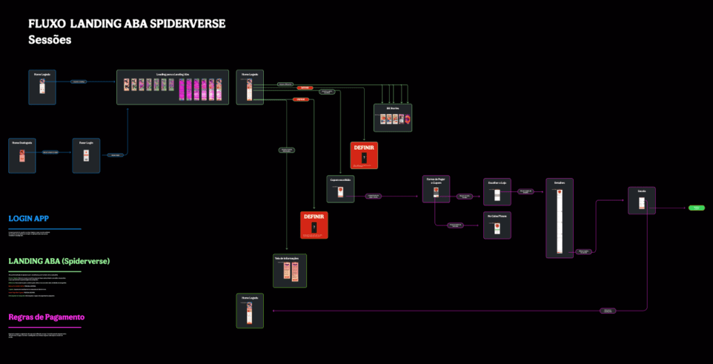
Task Flow
Action model of the organizational chart that connects the landing page, which comes from the primary banner, to the Burger King app, and also clearly and didactically shows the paths that the user can take.
Wireframe
Globally unprecedented feature at Burger King, implemented for the first time with the Brazilian team. This gives us a fully customizable Landing Page structure, meaning we can remove and add features available to the user.
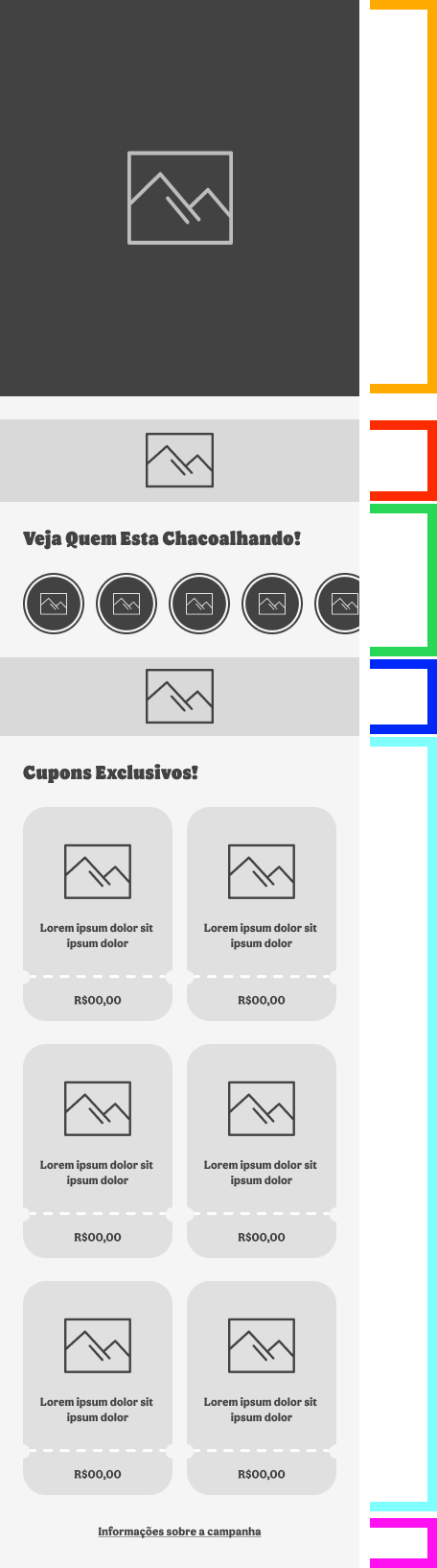
Banner Main
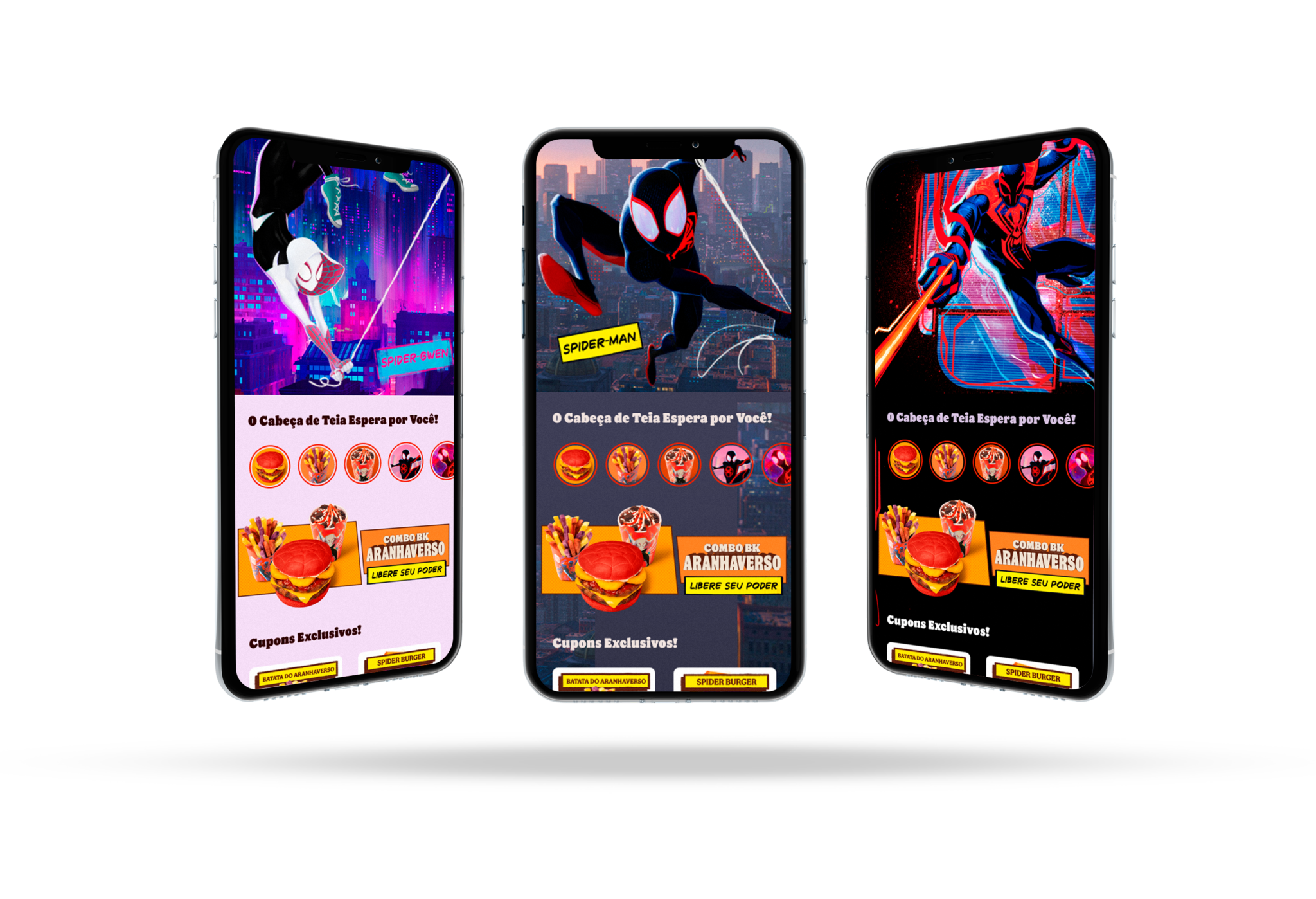
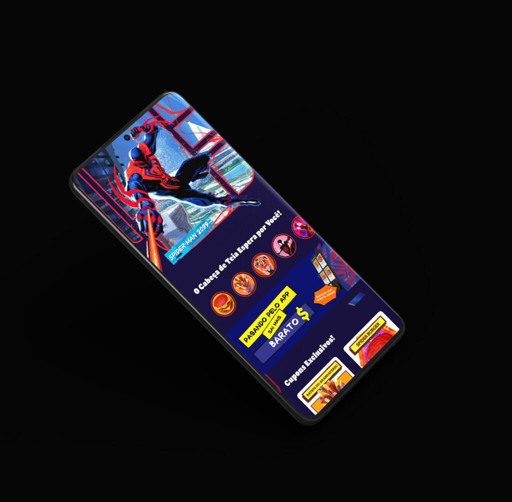
To capture the user’s attention and foster interactivity, we implemented a parallax effect. As the user scrolls the page on their mobile device, the campaign character, Spiderman, moves accordingly.
Campaign Logo
Designed to convey clarity and capture the customer’s attention while staying true to the Burger King brand essence.
BK Stories
In-app story feature, following the same format as Instagram and other social media platforms.
CTA Banner
Banner-style call to action that, when clicked, takes the user on a tour of all the locations within the Burger King app and offers the chance to win branded merchandise.
Strategic Coupons
Strategically placed within the landing page of the app, product coupons are key elements in this flowchart. As part of the product coupons team, myself and my team understand their importance. It’s worth noting that they will only appear on the landing page, and not anywhere else.
Campaign Legal Information
A dedicated section within the page should provide access to all legal information related to the campaign, including all rules and regulations for participants.
UI Design
The landing page was developed in collaboration with the Burger King app team, including developers and the UI team. I was responsible for the entire conception of the landing page, including the wireframe and images used.
Transition Home App/Landing Page
UX motion design for the transition between the app home screen and the landing page. This feature increases campaign visibility through a “multiverse” style transition inspired by the movie SpiderVerse.
The transition was created in After Effects and developed based on the lottiefile repository using json technology.
Parallax Banner Main
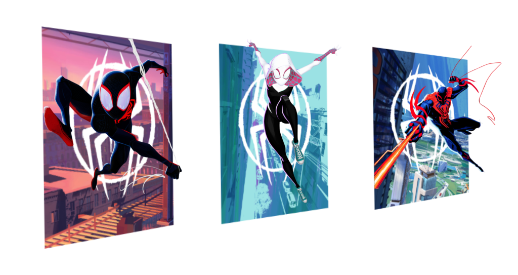
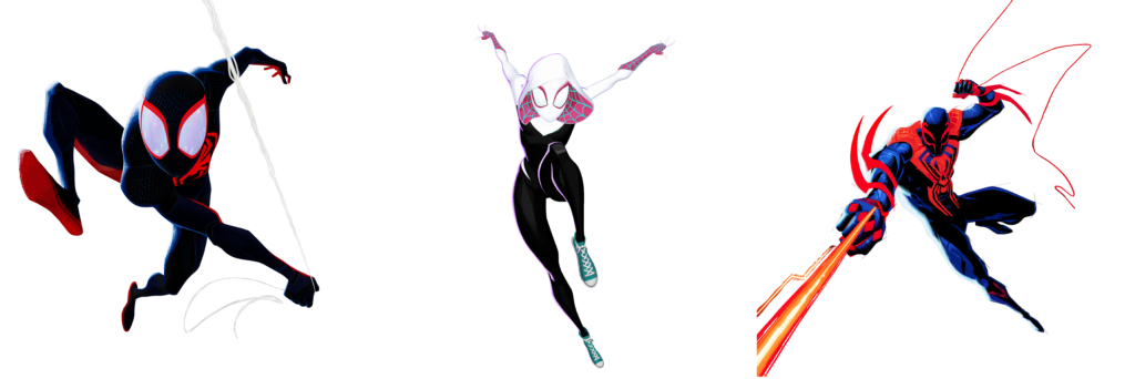
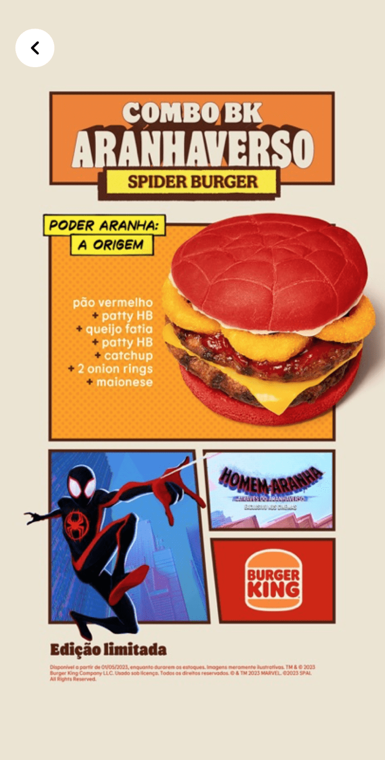
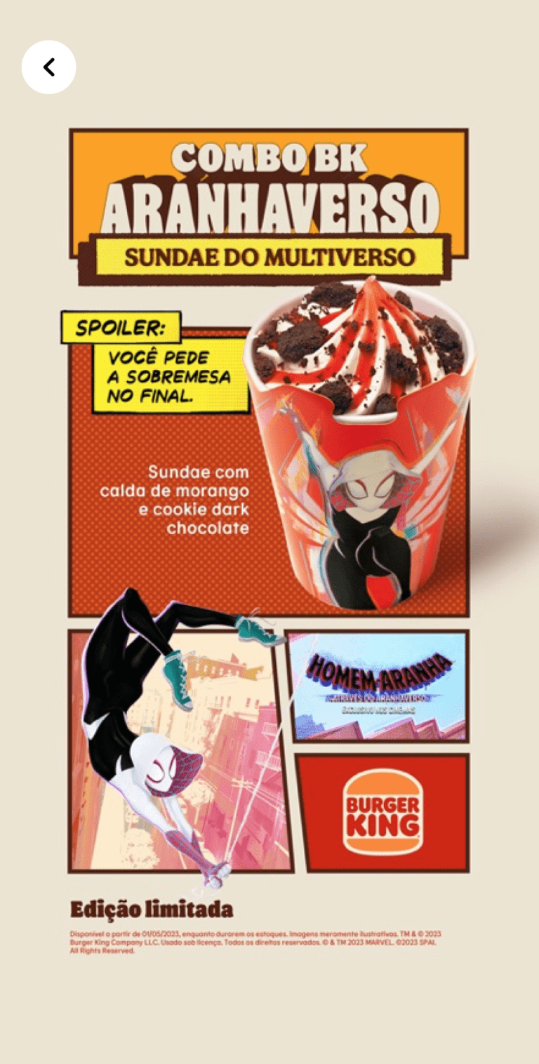
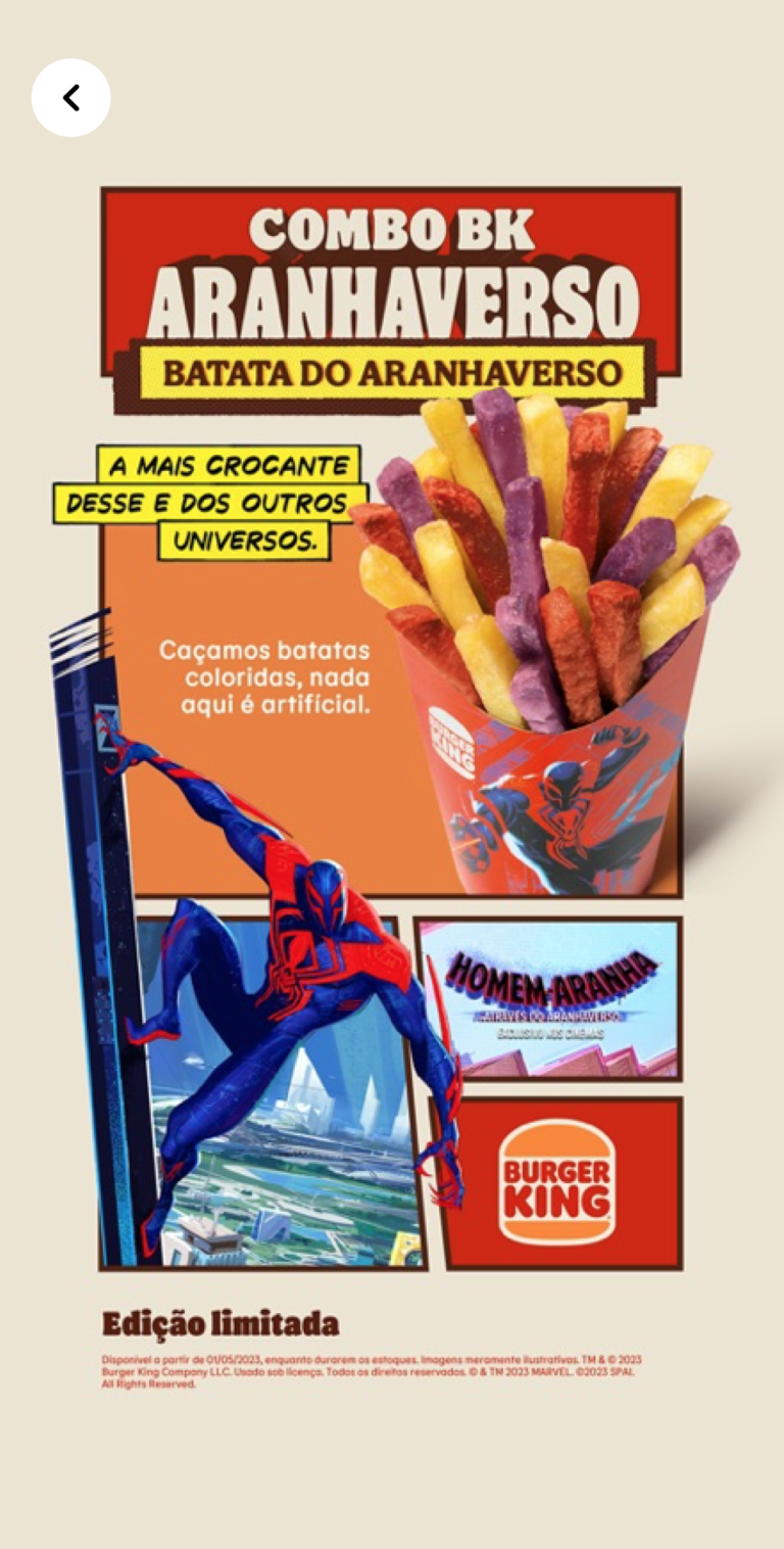
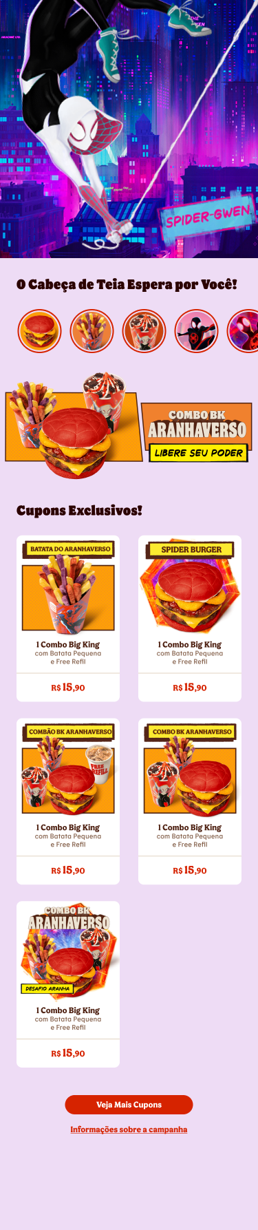
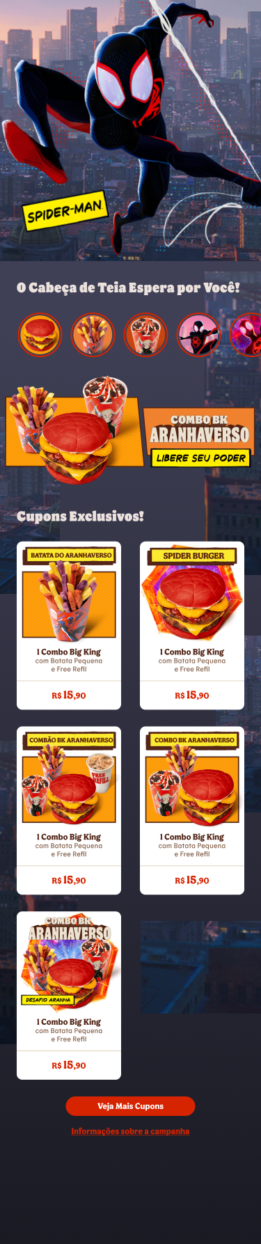
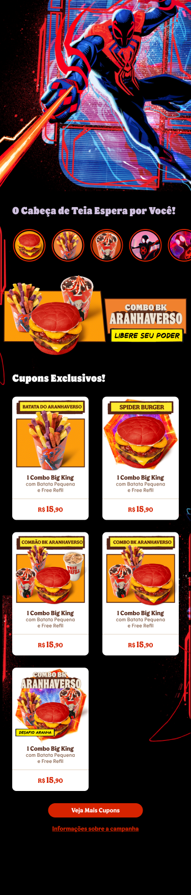
To convey the multiverse concept and create a closer connection with different types of customers, we created three landing pages, one for each character in the movie (Gwen, Miles Morales, and Spider-2099). Each landing page features its own unique animation and movement.
BK Stories
In-app story feature, following the same format as Instagram and other social media platforms.
User Flow
A comprehensive user journey map for our app, detailing all possible user paths and interactions. The map includes a flowchart that illustrates the actions that users can and can’t perform.
Ux Business Feature
Check out the numbers for the month-long campaign:
0
Users
0
Users
0
Users
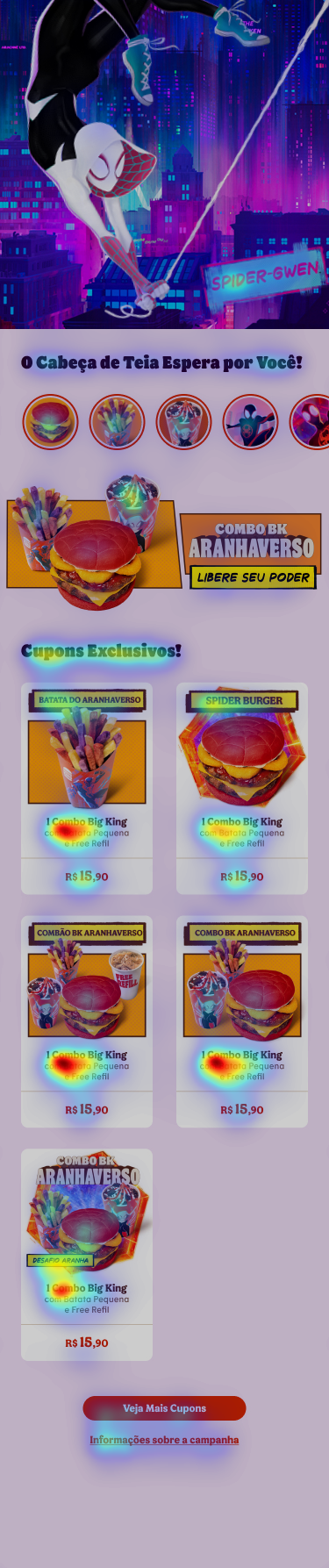
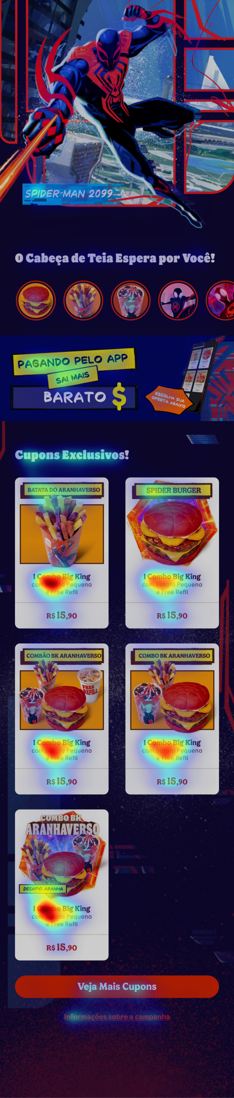
HeatMaps & Focus Maps
Heatmaps: Provide a visual representation of user interactions within your app, highlighting areas of high engagement and concentration. The red zones indicate the locations where users spend the most time, click the most frequently, or perform other significant actions.
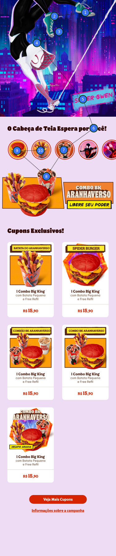
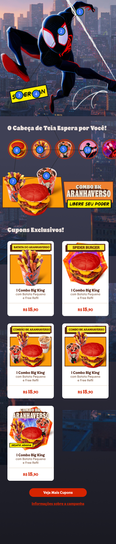
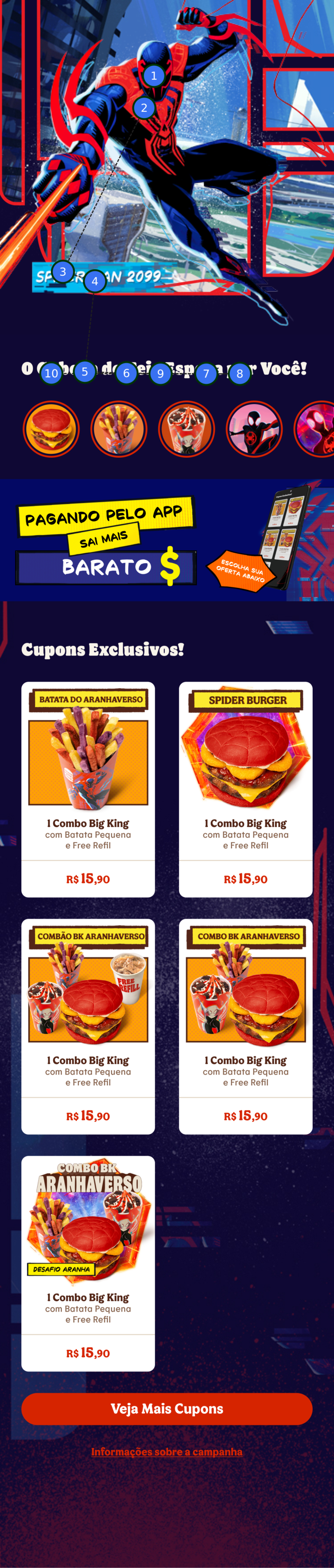
Focus Maps: Provide a detailed analysis of user attention within your app, revealing the areas that capture users’ focus and engagement. By understanding where users’ eyes are drawn, you can gain valuable insights into their preferences and behaviors, allowing you to optimize your app’s design and content for maximum impact.
FocusMap
Yo, I kicked off my hustle in the pro game at this offset printing joint, soaking up all them old-school ad tricks in the streets. But yo, my vibe was always reaching beyond them concrete jungle limits, hungry for that digital game.